From Surf Wiki (app.surf) — the open knowledge base
Primary color
Fundamental color in color mixing

Fundamental color in color mixing
colors
Primary colors are colorants or coloured lights that can be mixed in varying amounts to produce a gamut of colors. This is the essential method used to create the perception of a broad range of colors in, e.g., electronic displays, color printing, and paintings. Perceptions associated with a given combination of primary colors can be predicted by an appropriate mixing model (e.g., additive, subtractive) that uses the physics of how light interacts with physical media, and ultimately the retina to be able to accurately display the intended colors.
The most common colour mixing models are the additive primary colors (red, green, blue) and the subtractive primary colors (cyan, magenta, yellow). Red, yellow, and blue are also commonly taught as primary colors (usually in the context of subtractive color mixing as opposed to additive color mixing), despite some criticism due to its lack of scientific basis.
Primary colours can also be conceptual (not necessarily real), either as additive mathematical elements of a color space or as irreducible phenomenological categories in domains such as psychology and philosophy. Color space primaries are precisely defined and empirically rooted in psychophysical colorimetry experiments which are foundational for understanding color vision. Primaries of some color spaces are complete (that is, all visible colors are described in terms of their primaries weighted by nonnegative primary intensity coefficients) but necessarily imaginary (that is, there is no plausible way that those primary colors could be represented physically, or perceived). Phenomenological accounts of primary colors, such as the psychological primaries, have been used as the conceptual basis for practical color applications even though they are not a quantitative description in and of themselves.
Sets of color space primaries are generally arbitrary, in the sense that there is no one set of primaries that can be considered the canonical set. Primary pigments or light sources are selected for a given application on the basis of subjective preferences as well as practical factors such as cost, stability, availability etc.
The concept of primary colors has a long, complex history. The choice of primary colors has changed over time in different domains that study color. Descriptions of primary colors come from areas including philosophy, art history, color order systems, and scientific work involving the physics of light and perception of color.
Art education materials commonly use red, yellow, and blue as primary colors. While it is sometimes suggested that these three primaries can mix all colors it is important to note that no set of real colorants or lights can mix all possible colors. In other domains, the three primary colors are typically red, green and blue, which are more closely aligned to the sensitivities of the photoreceptor pigments in the cone cells.
Color model primaries
A color model is an abstract model intended to describe the ways that colors behave, especially in color mixing. Most color models are defined by the interaction of multiple primary colors. Since most humans are trichromatic, color models that want to reproduce a meaningful portion of a human's perceptual gamut must use at least three primaries. More than three primaries are allowed, for example, to increase the size of the gamut of the color space, but the entire human perceptual gamut can be reproduced with just three primaries (albeit imaginary ones as in the CIE XYZ color space).
Some humans (and most mammals) are dichromats, corresponding to specific forms of color blindness in which color vision is mediated by only two of the types of color receptors. Dichromats require only two primaries to reproduce their entire gamut and their participation in color matching experiments was essential in the determination of cone fundamentals leading to all modern color spaces. Despite most vertebrates being tetrachromatic, and therefore requiring four primaries to reproduce their entire gamut, there is only one scholarly report of a functional human tetrachromat, for which trichromatic color models are insufficient.{{cite journal | doi-access= free
Additive models

The perception elicited by multiple light sources co-stimulating the same area of the retina is additive, i.e., predicted via summing the spectral power distributions (the intensity of each wavelength) of the individual light sources assuming a color matching context. For example, a purple spotlight on a dark background could be matched with coincident blue and red spotlights that are both dimmer than the purple spotlight. If the intensity of the purple spotlight was doubled it could be matched by doubling the intensities of both the red and blue spotlights that matched the original purple. The principles of additive color mixing are embodied in Grassmann's laws.{{cite book | access-date = 31 December 2017
Additive mixing of coincident spot lights was applied in the experiments used to derive the CIE 1931 colorspace (see color space primaries section). The original monochromatic primaries of the wavelengths of 435.8 nm (violet), 546.1 nm (green), and 700 nm (red) were used in this application due to the convenience they afforded to the experimental work.{{cite journal
Small red, green, and blue elements (with controllable brightness) in electronic displays mix additively from an appropriate viewing distance to synthesize compelling colored images. This specific type of additive mixing is described as partitive mixing. Red, green, and blue light are popular primaries for partitive mixing since primary lights with those hues provide a large color triangle (gamut).
The exact colors chosen for additive primaries are a compromise between the available technology (including considerations such as cost and power usage) and the need for large chromaticity gamut. For example, in 1953 the NTSC specified primaries that were representative of the phosphors available in that era for color CRTs. Over decades, market pressures for brighter colors resulted in CRTs using primaries that deviated significantly from the original standard. Currently, ITU-R BT.709-5 primaries are typical for high-definition television.
Subtractive models


The subtractive color mixing model predicts the resultant spectral power distribution of light filtered through overlaid partially absorbing materials, usually in the context of an underlying reflective surface such as white paper. Each layer partially absorbs some wavelengths of light from the illumination while letting others pass through, resulting in a colored appearance. The resultant spectral power distribution is predicted by the wavelength-by-wavelength product of the spectral reflectance of the illumination and the product of the spectral reflectances of all of the layers. Overlapping layers of ink in printing mix subtractively over reflecting white paper, while the reflected light mixes in a partitive way to generate color images. Importantly, unlike additive mixture, the color of the mixture is not well predicted by the colors of the individual dyes or inks. The typical number of inks in such a printing process is 3 (CMY) or 4 (CMYK), but can commonly range to 6 (e.g., Pantone hexachrome). In general, using fewer inks as primaries results in more economical printing but using more may result in better color reproduction.
Cyan (C), magenta (M), and yellow (Y) are good chromatic subtractive primaries in that filters with those colors can be overlaid to yield a surprisingly large chromaticity gamut. A black (K) ink (from the older "key plate") is also used in CMYK systems to augment C, M and Y inks or dyes: this is more efficient in terms of time and expense and less likely to introduce visible defects. Before the color names cyan and magenta were in common use, these primaries were often known as blue and red, respectively, and their exact color has changed over time with access to new pigments and technologies.{{cite book
Traditional red, yellow, and blue primary colors as a subtractive system

Color theorists since the seventeenth century, and many artists and designers since that time, have taken red, yellow, and blue to be the primary colors (see history below). This RYB system, in "traditional color theory", is often used to order and compare colors, and sometimes proposed as a system of mixing pigments to get a wide range of, or "all", colors. O'Connor, Zena. "Traditional colour theory: A review." Color Research & Application, 8 January 2021. O'Connor describes the role of RYB primaries in traditional color theory:
Traditional color theory is based on experience with pigments, more than on the science of light. In 1920, Snow and Froehlich explained:
The widespread adoption of teaching of RYB as primary colors in post-secondary art schools in the twentieth century has been attributed to the influence of the Bauhaus, where Johannes Itten developed his ideas on color during his time there in the 1920s, and of his book on color published in 1961.
In discussing color design for the web, Jason Beaird writes:
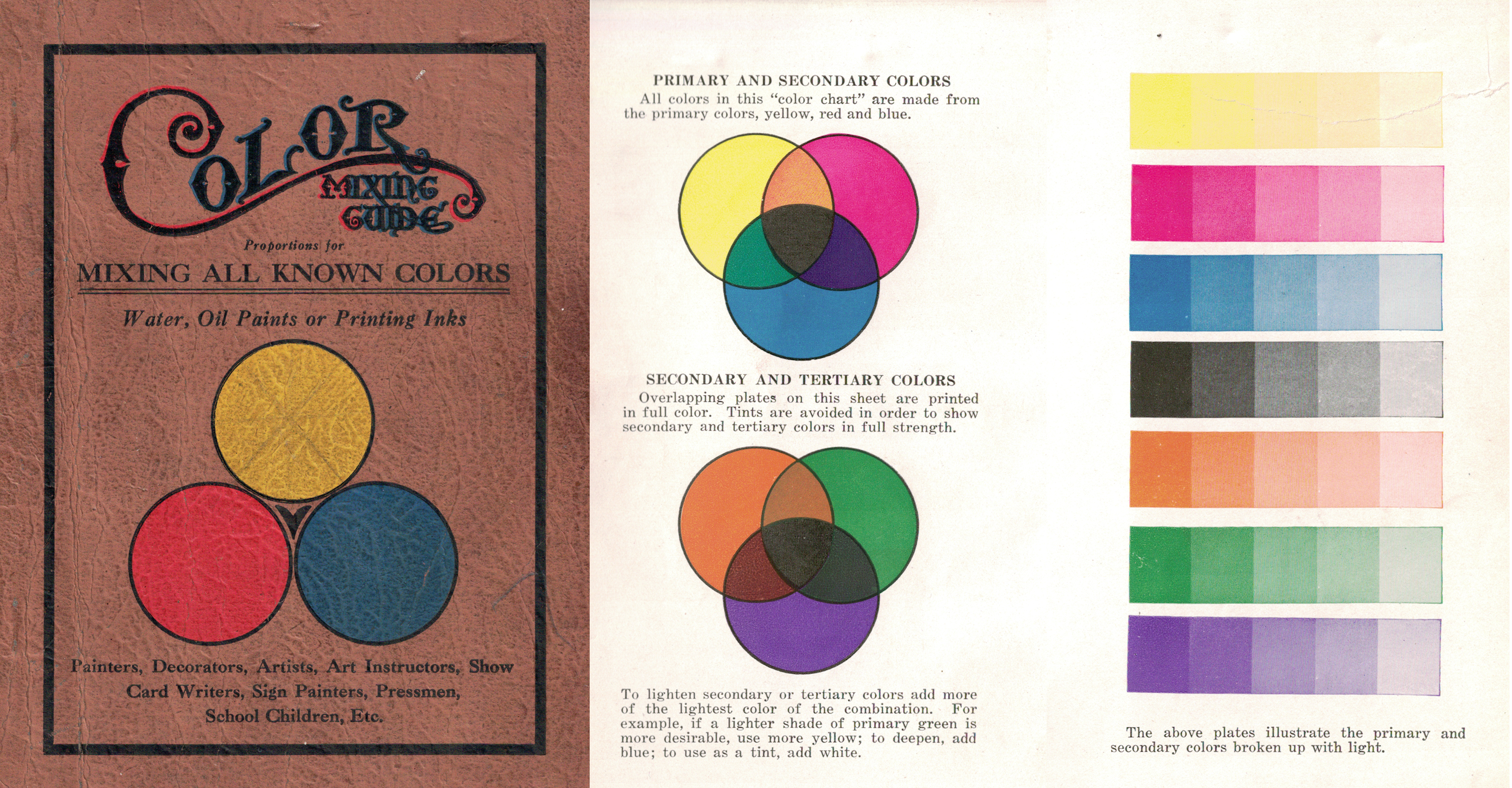
As with any system of real primaries, not all colors can be mixed from RYB primaries. | access-date = 12 December 2017 For example, if the blue pigment is a deep Prussian blue, then a muddy desaturated green may be the best that can be had by mixing with yellow. To achieve a larger gamut of colors via mixing, the blue and red pigments used in illustrative materials such as the Color Mixing Guide in the image are often closer to peacock blue (a blue-green or cyan) and carmine (or crimson or magenta) respectively. Printers traditionally used inks of such colors, known as "process blue" and "process red", before modern color science and the printing industry converged on the process colors (and names) cyan and magenta. RYB is not the same as CMY, nor exactly subtractive, but there are several ways to conceptualize traditional RYB as a subtractive system in the framework of modern color science.
Faber-Castell identifies the following three colors: "Cadmium yellow" (number 107) for yellow, "Phthalo blue" (number 110) for blue and "Deep scarlet red" (number 219) for red, as the closest to primary colors for its Art & Graphic color pencils range. "Cadmium yellow" (number 107) for yellow, "Phthalo blue" (number 110) for blue and "Pale geranium lake" (number 121) for red, are provided as primary colors in its basic 5 color "Albrecht Dürer" watercolor marker set.
Mixing pigments in limited palettes
Main article: Paint mixing

The first known use of red, yellow, and blue as "simple" or "primary" colors, by Chalcidius, ca. AD 300, was possibly based on the art of paint mixing.
Mixing pigments for the purpose of creating realistic paintings with diverse color gamuts is known to have been practiced at least since Ancient Greece (see history section). The identity of a set of minimal pigments to mix diverse gamuts has long been the subject of speculation by theorists whose claims have changed over time, for example, Pliny's white, black, one or another red, and "sil", which might have been yellow or blue; Robert Boyle's white, black, red, yellow, and blue; and variations with more or fewer "primary" color or pigments. Some writers and artists have found these schemes difficult to reconcile with the actual practice of painting. Nonetheless, it has long been known that limited palettes consisting of a small set of pigments are sufficient to mix a diverse gamut of colors.{{cite journal
The set of pigments available to mix diverse gamuts of color (in various media such as oil, watercolor, acrylic, gouache, and pastel) is large and has changed throughout history. There is no consensus on a specific set of pigments that are considered primary colors the choice of pigments depends entirely on the artist's subjective preference of subject and style of art, as well as material considerations like lightfastness and mixing behavior. A variety of limited palettes have been employed by artists for their work.
The color of light (i.e., the spectral power distribution) reflected from illuminated surfaces coated in paint mixes is not well approximated by a subtractive or additive mixing model. Color predictions that incorporate light scattering effects of pigment particles and paint layer thickness require approaches based on the Kubelka–Munk equations, but even such approaches are not expected to predict the color of paint mixtures precisely due to inherent limitations. Artists typically rely on mixing experience and "recipes" to mix desired colors from a small initial set of primaries and do not use mathematical modeling.
MacEvoy explains why artists often chose a palette closer to RYB than to CMY:
Color space primaries


A color space is a subset of a color model, where the primaries have been defined, either directly as photometric spectra, or indirectly as a function of other color spaces. For example, sRGB and Adobe RGB are both color spaces based on the RGB color model. However, the green primary of Adobe RGB is more saturated than the equivalent in sRGB, and therefore yields a larger gamut. Otherwise, choice of color space is largely arbitrary and depends on the utility to a specific application.
Imaginary primaries
Color space primaries are derived from canonical colorimetric experiments that represent a standardized model of an observer (i.e., a set of color matching functions) adopted by Commission Internationale de l'Eclairage (CIE) standards. The abbreviated account of color space primaries in this section is based on descriptions in Colorimetry - Understanding The CIE System.
The CIE 1931 standard observer is derived from experiments in which participants observe a foveal secondary bipartite field with a dark surround. Half of the field is illuminated with a monochromatic test stimulus (ranging from 380 nm to 780 nm) and the other half is the matching stimulus illuminated with three coincident monochromatic primary lights: 700 nm for red (R), 546.1 nm for green (G), and 435.8 nm for blue (B). These primaries correspond to CIE RGB color space. The intensities of the primary lights could be adjusted by the participant observer until the matching stimulus matched the test stimulus, as predicted by Grassman's laws of additive mixing. Different standard observers from other color matching experiments have been derived since 1931. The variations in experiments include choices of primary lights, field of view, number of participants etc. but the presentation below is representative of those results.
Matching was performed across many participants in incremental steps along the range of test stimulus wavelengths (380 nm to 780 nm) to ultimately yield the color matching functions: \overline{r}(\lambda), \overline{g}(\lambda) and \overline{b}(\lambda) that represent the relative intensities of red, green, and blue light to match each wavelength (\lambda). These functions imply that [C] units of the test stimulus with any spectral power distribution, P(\lambda), can be matched by [R], [G], and [B] units of each primary where:
[C] = \int_{380\text{ nm}}^{780\text{ nm}} \overline{r}(\lambda) P(\lambda),d\lambda \cdot [R] + \int_{380\text{ nm}}^{780\text{ nm}} \overline{g}(\lambda) P(\lambda),d\lambda \cdot [G] + \int_{380\text{ nm}}^{780\text{ nm}} \overline{b}(\lambda) P(\lambda),d\lambda \cdot [B]. |}}
Each integral term in the above equation is known as a tristimulus value and measures amounts in the adopted units. No set of real primary lights can match another monochromatic light under additive mixing so at least one of the color matching functions is negative for each wavelength. A negative tristimulus value corresponds to that primary being added to the test stimulus instead of the matching stimulus to achieve a match.
The negative tristimulus values made certain types of calculations difficult, so the CIE put forth new color matching functions \overline{x}(\lambda), \overline{y}(\lambda), and \overline{z}(\lambda) defined by the following linear transformation:
\begin{bmatrix} \overline{x}(\lambda) \ \overline{y}(\lambda) \ \overline{z}(\lambda) \end{bmatrix}
\begin{bmatrix} 2.768892 & 1.751748 & 1.130160 \ 1.000000 & 4.590700 & 0.060100 \ 0 & 0.056508 & 5.594292 \ \end{bmatrix} \begin{bmatrix} \overline{r}(\lambda) \ \overline{g}(\lambda) \ \overline{b}(\lambda) \end{bmatrix}. |}}
These new color matching functions correspond to imaginary primary lights X, Y, and Z (CIE XYZ color space). All colors can be matched by finding the amounts [X], [Y], and [Z] analogously to [R], [G], and [B] as defined in . The functions \overline{x}(\lambda), \overline{y}(\lambda), and \overline{z}(\lambda) based on the specifications that they should be nonnegative for all wavelengths, \overline{y}(\lambda) be equal to photometric luminance, and that [X]=[Y]=[Z] for an equienergy (i.e., a uniform spectral power distribution) test stimulus.
Derivations use the color matching functions, along with data from other experiments, to ultimately yield the cone fundamentals: \overline{l}(\lambda), \overline{m}(\lambda) and \overline{s}(\lambda). These functions correspond to the response curves for the three types of color photoreceptors found in the human retina: long-wavelength (L), medium-wavelength (M), and short-wavelength (S) cones. The three cone fundamentals are related to the original color matching functions by the following linear transformation (specific to a 10° field):
\begin{bmatrix} \overline{l}(\lambda) \ \overline{m}(\lambda) \ \overline{s}(\lambda) \end{bmatrix}
\begin{bmatrix} 0.192325269 & 0.749548882 & 0.0675726702 \ 0.0192290085 & 0.949098496 & 0.113830196 \ 0 & 0.0105107859 & 0.991427669 \ \end{bmatrix} \begin{bmatrix} \overline{r}(\lambda) \ \overline{g}(\lambda) \ \overline{b}(\lambda) \end{bmatrix}. |}}
LMS color space comprises three primary lights (L, M, and S) that stimulate only the L-, M-, and S-cones respectively. A real primary that stimulates only the M-cone is impossible, and therefore these primaries are imaginary. The LMS color space has significant physiological relevance as these three photoreceptors mediate trichromatic color vision in humans.
Both XYZ and LMS color spaces are complete since all colors in the gamut of the standard observer are contained within their color spaces. Complete color spaces must have imaginary primaries, but color spaces with imaginary primaries are not necessarily complete (e.g. ProPhoto RGB color space).
Real primaries

Color spaces used in color reproduction must use real primaries that can be reproduced by practical sources, either lights in additive models, or pigments in subtractive models. Most RGB color spaces have real primaries, though some maintain imaginary primaries. For example, all the sRGB primaries fall within the gamut of human perception, and so can be easily represented by practical light sources, including CRT and LED displays, hence why sRGB is still the color space of choice for digital displays.
A color in a color space is defined as a combination of its primaries, where each primary must give a non-negative contribution. Any color space based on a finite number of real primaries is incomplete in that it cannot reproduce every color within the gamut of the standard observer.
Practical color spaces such as sRGB and scRGB are typically (at least partially) defined in terms of linear transformations from CIE XYZ, and color management often uses CIE XYZ as a middle point for transformations between two other color spaces.
Most color spaces in the color-matching context (those defined by their relationship to CIE XYZ) inherit its three-dimensionality. However, more complex color appearance models like CIECAM02 require extra dimensions to describe colors appear under different viewing conditions.
Psychological primaries

Main article: Unique hues
The opponent process was proposed by Ewald Hering in which he described the four unique hues (later called psychological primaries in some contexts): red, green, yellow and blue. To Hering, the unique hues appeared as pure colors, while all others were "psychological mixes" of two of them. Furthermore, these colors were organized in "opponent" pairs, red vs. green and yellow vs. blue so that mixing could occur across pairs (e.g., a yellowish green or a yellowish red) but not within a pair (i.e., reddish green cannot be imagined). An achromatic opponent process along black and white is also part of Hering's explanation of color perception. Hering asserted that we did not know why these color relationships were true but knew that they were. Although there is a great deal of evidence for the opponent process in the form of neural mechanisms,{{cite journal
The psychological primaries were applied by Richard S. Hunter as the primaries for Hunter L,a,b colorspace that led to the creation of CIELAB. The Natural Color System is also directly inspired by the psychological primaries.{{cite book | editor-last1 = Hardin | editor-first1 = C.L.
History
Philosophy
Philosophical writing from ancient Greece has described notions of primary colors, but they can be difficult to interpret in terms of modern color science. Theophrastus (c. 371–287 BCE) described Democritus' position that the primary colors were white, black, red, and green. In Classical Greece, Empedocles identified white, black, red, and, (depending on the interpretation) either yellow or green as primary colors. Aristotle described a notion in which white and black could be mixed in different ratios to yield chromatic colors; this idea had considerable influence in Western thinking about color. François d'Aguilon's 16th century notion of the five primary colors (white, yellow, red, blue, black) was influenced by Aristotle's idea of the chromatic colors being made of black and white.The 20th century philosopher Ludwig Wittgenstein explored color-related ideas using red, green, blue, and yellow as primary colors.{{cite journal |access-date = 2017-12-11 |archive-date = 2017-12-11 |archive-url = https://web.archive.org/web/20171211104829/http://wittgensteinrepository.org/agora-alws/article/view/2704/3132

Light and color vision
Isaac Newton used the term "primary color" to describe the colored spectral components of sunlight. A number of color theorists did not agree with Newton's work. David Brewster advocated that red, yellow, and blue light could be combined into any spectral hue late into the 1840s. Thomas Young proposed red, green, and violet as the three primary colors, while James Clerk Maxwell favored changing violet to blue. Hermann von Helmholtz proposed "a slightly purplish red, a vegetation-green, slightly yellowish, and an ultramarine-blue" as a trio.{{cite book
Colorants
Twentieth century art historian John Gage's The Fortunes Of Apelles provides a summary of the history of primary colors as pigments in painting and describes the evolution of the idea as complex. Gage begins by describing Pliny the Elder's account of notable Greek painters who used four primaries. Pliny distinguished the pigments (i.e., substances) from their apparent colors: white from Milos (ex albis), red from Sinope (ex rubris), Attic yellow (sil) and atramentum (ex nigris). Sil was historically confused as a blue pigment between the 16th and 17th centuries, leading to claims about white, black, red, and blue being the fewest colors required for painting. Thomas Bardwell, an 18th century Norwich portrait painter, was skeptical of the practical relevance of Pliny's account.
Robert Boyle, the Irish chemist, introduced the term primary color in English in 1664 and claimed that there were five primary colors (white, black, red, yellow, and blue). The German painter Joachim von Sandrart eventually proposed removing white and black from the primaries and that one only needed red, yellow, blue, and green to paint "the whole creation".
| Year | Author | Color terms | Descriptive term |
|---|---|---|---|
| c. 325 | Chalcidius | Pallidus, rubeus, cyaneus | Generic colors |
| c. 1266 | Roger Bacon | Glaucus, rubeus, viriditas | Principal species |
| c. 1609 | Anselmus de Boodt | Flavus, ruber, caeruleus | Principal colors |
| c. 1613 | François d'Aguilon | Flavus, rubeus, caeruleus | Simple colors |
| c. 1664 | Robert Boyle | Yellow, red, blue | Simple, primary |
| c. 1680 | André Félibien | Jaune, rouge, bleu | Principal, primitive |
Red, yellow, and blue as primaries became a popular notion in the 18th and 19th centuries. Jacob Christoph Le Blon, an engraver, was the first to use separate plates for each color in mezzotint printmaking: yellow, red, and blue, plus black to add shades and contrast. Le Blon used primitive in 1725 to describe red, yellow, and blue in a very similar sense as Boyle used primary. Moses Harris, an entomologist and engraver, also describes red, yellow, and blue as "primitive" colors in 1766. Léonor Mérimée described red, yellow, and blue in his book on painting (originally published in French in 1830) as the three simple/primitive colors that can make a "great variety" of tones and colors found in nature. George Field, a chemist, used the word primary to describe red, yellow, and blue in 1835. Michel Eugène Chevreul, also a chemist, discussed red, yellow, and blue as "primary" colors in 1839.
Color order systems


Historical perspectives on color order systems ("catalogs" of color) that were proposed in the 18th and 19th centuries describe them as using red, yellow, and blue pigments as chromatic primaries. Tobias Mayer (a German mathematician, physicist, and astronomer) described a triangular bipyramid with red, yellow and blue at the 3 vertices in the same plane, white at the top vertex, and black and the bottom vertex in a public lecture in 1758. There are 11 planes of colors between the white and black vertices inside the triangular bipyramid. Mayer did not seem to distinguish between colored light and colorant though he used vermilion, orpiment (King's yellow), and Bergblau (azurite) in partially complete colorings of planes in his solid. Johann Heinrich Lambert (a Swiss mathematician, physicist, and astronomer) proposed a triangular pyramid with gamboge, carmine, and Prussian blue as primaries and only white at the top vertex (since Lambert could produce a mixture that was sufficiently black with those pigments). Lambert's work on this system was published in 1772. Philipp Otto Runge (the Romantic German painter) firmly believed in the theory of red, yellow and blue as the primary colors (again without distinguishing light color and colorant). His color sphere was ultimately described in an essay titled Farben-Kugel (color ball) published by Goethe in 1810. His spherical model of colors equally spaced red, yellow, and blue longitudinally with orange, green, and violet between them, and white and black at opposite poles.
Red, yellow, and blue as primary colors
Numerous authors have taught that red, yellow, and blue (RYB) are the primary colors in art education materials since at least the 19th century, following the ideas introduced above from earlier centuries.
A wide variety of contemporary educational sources also describe the RYB primaries. These sources range from children's books and art material manufacturers to painting and color guides. Art education materials often suggest that RYB primaries can be mixed to create all other colors.{{cite web | access-date = 10 December 2017 | archive-date = 11 December 2017 | archive-url = https://web.archive.org/web/20171211105219/https://www.nga.gov/education/teachers/lessons-activities/elements-of-art/color.html
Criticism
Albert Munsell, an American painter (and creator of the early 20th century Munsell color system), referred to the notion of RYB primaries as "mischief", "a widely accepted error", and underspecified in his book A Color Notation, first published in 1905.
Itten's ideas about RYB primaries have been criticized as ignoring modern color science with demonstrations that some of Itten's claims about mixing RYB primaries are impossible.
References
References
- Bruce MacEvoy. "Do 'Primary' Colors Exist?" ([http://www.handprint.com/HP/WCL/color6.html#imaginary imaginary or imperfect primaries section] {{Webarchive. link. (17 July 2008 ). ''Handprint''. Accessed 10 August 2007.)
- [https://science.howstuffworks.com/primary-colors.htm Primary Colors Are Red, Yellow and Blue, Right? Well, Not Exactly], ''HowStuffWorks''
- [https://www.olympus-lifescience.com/en/microscope-resource/primer/lightandcolor/primarycolorsintro/ Introduction to the Primary Colors], ''Olympus Life Science''
- (2012). "Handbook of visual display technology". Springer.
- (May 1998). "Evolution of colour vision in vertebrates". Eye.
- (2016). "Encyclopedia of Color Science and Technology".
- (November 2017). "Farbensehen der Tiere: Von farbenblinden Seehunden und tetrachromatischen Vögeln". Der Ophthalmologe.
- (1983). "Light and color in nature and art". Wiley.
- (2019). "Billmeyer and Saltzman's principles of color technology".
- (27 July 2007). "Colorimetry".
- (26 January 2016). "Colour Reproduction in Electronic Imaging Systems: Photography, Television, Cinematography". John Wiley & Sons.
- "Frequently Asked Questions about Color".
- (2016). "Handbook of visual display technology". Springer.
- (9 April 2019). "Billmeyer and Saltzman's Principles of Color Technology". John Wiley & Sons.
- "Additive versus subtractive color mixing".
- (2011). "Color mixture". Scholarpedia.
- (2018). "Understanding color management".
- (2012). "Handbook of visual display technology". Springer.
- "Color FAQ - Frequently Asked Questions Color".
- "FOGRA characterization data".
- (2009). "Digital color management: principles and strategies for the standardized print production". Springer.
- Bonnie E. Snow and Hugo B. Froehlich. (1920). "The Theory and Practice of Color". Prang.
- "Rethinking Web Color: Classical Color Wheels for Modern Digital Design".
- (1909). "Landscape Painting". Scribbner.
- Kuehni, Rolf G. "Development of the idea of simple colors in the 16th and early 17th centuries". ''Color Research & Application'' 32.2 (2007): 92–99.
- (1999). "Color and Culture: Practice and Meaning from Antiquity to Abstraction". University of California Press.
- (1664). "Experiments and Considerations touching Colours". Henry Herringman.
- (1973). "Modern chromatics; students' text-book of color, with applications to art and industry.". Van Nostrand Reinhold Co.
- (1907). "A Color Notation".
- (1926). "The Art of Water Colour Painting". C. Scribner's Sons.
- (30 March 2007). "Pigment Compendium: A Dictionary of Historical Pigments". Routledge.
- (2002). "Bright earth: art and the invention of color". Farrar, Straus and Giroux.
- "handprint: learning color through paints".
- "palette paintings".
- (2010). "Color and Light: A Guide for the Realist Painter". Andrews McMeel Publishing.
- (1 October 1992). "Modeling pigmented materials for realistic image synthesis". ACM Transactions on Graphics.
- (8 August 2014). "Proceedings of the Workshop on Non-Photorealistic Animation and Rendering".
- (1997). "Proceedings of the 24th annual conference on Computer graphics and interactive techniques - SIGGRAPH '97".
- (August 2012). "1,500 Color Mixing Recipes for Oil, Acrylic & Watercolor: Achieve Precise Color when Painting Landscapes, Portraits, Still Lifes, and More". Walter Foster Publishing.
- "handprint: basic mixing method".
- "imaginary or imperfect primaries".
- "What is Meant by the Term "Observer Angle"?".
- (December 1955). "Interim Report to the Commission Internationale de l'Eclairage, Zurich, 1955, on the National Physical Laboratory's Investigation of Colour-matching (1955)". Optica Acta: International Journal of Optics.
- (December 1955). "Interim Report to the Commission Internationale de l'Eclairage, Zurich, 1955, on the National Physical Laboratory's Investigation of Colour-matching (1955)". Optica Acta: International Journal of Optics.
- "Colour matching functions - Stiles & Burch (1955) 2-deg, RGB CMFs".
- "Colour matching functions - 2-deg XYZ CMFs transformed from the CIE (2006) 2-deg LMS cone fundamentals".
- (2006). "Fundamental chromaticity diagram with physiological axes. Part 1.". Commission internationale de l'eclairage.
- "CVRL functions - 2-deg fundamentals based on the Stiles and Burch 10-deg CMFs adjusted to 2-deg".
- "sRGB vs. Adobe RGB 1998".
- (2007). "Colorimetry: understanding the CIE system". CIE/Commission internationale de l'eclairage.
- (17 February 2021). "Impact of Color-Matching Primaries on Observer Matching: Part I – Accuracy". LEUKOS.
- (5 November 1996). ["A Standard Default Color Space for the Internet – sRGB, Version 1.10"](https://www.w3.org/Graphics/Color/sRGB.html ).
- (23 January 2003). "Multimedia systems and equipment - Colour measurement and management - Part 2-2: Colour management - Extended RGB colour space - scRGB".
- (2013). "Color Appearance Models.". Wiley.
- (1920). "Grundzüge der Lehre vom Lichtsinn". Springer Berlin Heidelberg.
- (1964). "Outlines of a theory of the light sense.". Harvard Univ. Press.
- (1994). "In the eye's mind: vision and the Helmholtz-Hering controversy". Princeton University Press.
- (21 May 2010). "Color Ontology and Color Science". MIT Press.
- "Application Note AN 1005.00 Measuring color using Hunter L, a, b versus CIE 1976 Lab*". Hunter Associates Laboratory Inc.
- (2020). "Pioneers of Color Science".
- (2005). "The Big Typescript, TS. 213". Blackwell Pub.
- "do "primary" colors exist?".
- Newton, Isaac. (1730). "Opticks: Or, A Treatise of the Reflections, Refractions, Inflections and Colours of Light". William Innys at the West-End of St. Paul's..
- (19 February 1671). "A Letter of Mr. Isaac Newton … containing his New Theory about Light and Color". Philosophical Transactions of the Royal Society.
- "The Representation of Color Metrics and Mappings in Perceptual Color Space".
- "handprint: colormaking attributes".
- (2013). "The Scientific Papers of James Clerk Maxwell". Courier Corporation.
- (2003). "The science of color". Elsevier.
- "Pliny the Elder, The Natural History, Book XXXV. An Account of Paintings and Colours.".
- (1756). "The practice of painting and perspective made easy: in which is contained, the art of painting in oil, with the method of colouring ... and a new, short, and familiar account of the art of perspective, illustrated with copper-plates, engraved by Mr. Vivares". London : Printed by S. Richardson, for the author, and sold by him ... and by A. Millar ... R. and J. Dodsley ..., and J. and J. Rivington ....
- "The Dimensions of Colour, primary colours".
- (1766). "The natural system of colours: wherein is displayed the regular and beautiful order and arrangement, arising from the three premitives, red, blue, and yellow, the manner in which each colour is formed, and its composition, the dependance [sic] they have on each other, and by their harmonious connections are produced the teints, or colours, of every object in the creation, and those teints, tho' so numerous as 660, are all comprised in thirty three terms, only". Laidler's office, Princes-Street, Licester-Fields.
- (1839). "The Art of Painting in Oil and in Fresco, Being a History of the Various Processes and Materials Employed, from Its Discovery". Whittaker & co..
- (1835). "Chromatography; Or, A Treatise on Colours and Pigments: And of Their Powers in Painting". Tilt and Bogue.
- Chevreul, Michel Eugène. (1861). "The Laws of Contrast of Colour". Routledge, Warne, and Routledge.
- "handprint: colormaking attributes".
- (1772). "Beschreibung einer mit Calauischem Wachse ausgeführten Farbenpyramide". Haude und Spener.
- "handprint: colormaking attributes".
- (2003). "Color space and its divisions: color order from antiquity to the present". Wiley-Interscience.
- "Philipp Otto Runge's Color Sphere A translation, with related materials and an essay".
- (1856). "Handbook of Young Artists and Amateurs in Oil Painting: Being Chiefly a Condensed Compilation from the Celebrated Manual of Bouvier ... Appended, A New Explanatory and Critical Vocabulary". J. Wiley & son.
- (1888). "Primary Object Lessons: For Training the Senses and Developing the Faculties of Children ...". Harper & Bros..
- (1923). "Color mixing guide for artists, painters, decorators, printing pressmen, show card writers, sign painters, color mixers, give color mixtures by parts.". Fine Arts Publishing.
- (2008). "Red, yellow, blue, and you". Abbeville Kids.
- "Crayola Support FAQ-What are the primary colors?".
- (16 March 2011). "Watercolor Painting For Dummies". John Wiley & Sons.
- Stephen Quiller. (2002). "Color Choices". Watson–Guptill.
- (20 November 2018). "Leonardo's Art Workshop: Invent, Create, and Make STEAM Projects like a Genius". Rockport Publishers.
- (1907). "A Color Notation".
- (December 2018). "How much colour science is not too much?". Color Research & Application.
This article was imported from Wikipedia and is available under the Creative Commons Attribution-ShareAlike 4.0 License. Content has been adapted to SurfDoc format. Original contributors can be found on the article history page.
Ask Mako anything about Primary color — get instant answers, deeper analysis, and related topics.
Research with MakoFree with your Surf account
Create a free account to save articles, ask Mako questions, and organize your research.
Sign up freeThis content may have been generated or modified by AI. CloudSurf Software LLC is not responsible for the accuracy, completeness, or reliability of AI-generated content. Always verify important information from primary sources.
Report