From Surf Wiki (app.surf) — the open knowledge base
Funnel plot
Type of graph used in research
Type of graph used in research
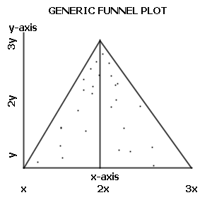
A funnel plot is a graph designed to check for the existence of publication bias; funnel plots are commonly used in systematic reviews and meta-analyses. In the absence of publication bias, it assumes that studies with high precision will be plotted near the average, and studies with low precision will be spread evenly on both sides of the average, creating a roughly funnel-shaped distribution. Deviation from this shape can indicate publication bias.
Quotation
Funnel plots, introduced by Light and Pillemer in 1984{{Cite book | url-access = registration and discussed in detail by Matthias Egger and colleagues,{{Cite journal are useful adjuncts to meta-analyses. A funnel plot is a scatterplot of treatment effect against a measure of study precision. It is used primarily as a visual aid for detecting bias or systematic heterogeneity. A symmetric inverted funnel shape arises from a 'well-behaved' data set, in which publication bias is unlikely. An asymmetric funnel indicates a relationship between treatment effect estimate and study precision. This suggests the possibility of either publication bias or a systematic difference between studies of higher and lower precision (typically 'small study effects'). Asymmetry can also arise from use of an inappropriate effect measure. Whatever the cause, an asymmetric funnel plot leads to doubts over the appropriateness of a simple meta-analysis and suggests that there needs to be investigation of possible causes.
A variety of choices of measures of 'study precision' is available, including total sample size, standard error of the treatment effect, and inverse variance of the treatment effect (weight). Sterne and Egger have compared these with others, and conclude that the standard error is to be recommended. When the standard error is used, straight lines may be drawn to define a region within which 95% of points might lie in the absence of both heterogeneity and publication bias.
In common with confidence interval plots, funnel plots are conventionally drawn with the treatment effect measure on the horizontal axis, so that study precision appears on the vertical axis, breaking with the general rule. Since funnel plots are principally visual aids for detecting asymmetry along the treatment effect axis, this makes them considerably easier to interpret.
Criticism
The funnel plot is not without problems. If high-precision studies are different from low-precision studies with respect to effect size (e.g., due to different populations examined) a funnel plot may give a wrong impression of publication bias.{{Cite journal The appearance of the funnel plot can change quite dramatically depending on the scale on the y-axis — whether it is the inverse square error or the trial size.{{Cite journal
References
References
- (2005). "In an empirical evaluation of the funnel plot, researchers could not visually identify publication bias". Journal of Clinical Epidemiology.
This article was imported from Wikipedia and is available under the Creative Commons Attribution-ShareAlike 4.0 License. Content has been adapted to SurfDoc format. Original contributors can be found on the article history page.
Ask Mako anything about Funnel plot — get instant answers, deeper analysis, and related topics.
Research with MakoFree with your Surf account
Create a free account to save articles, ask Mako questions, and organize your research.
Sign up freeThis content may have been generated or modified by AI. CloudSurf Software LLC is not responsible for the accuracy, completeness, or reliability of AI-generated content. Always verify important information from primary sources.
Report