From Surf Wiki (app.surf) — the open knowledge base
Franklin Gothic
Family of sans-serif fonts

Family of sans-serif fonts
| Field | Value |
|---|---|
| image | FranklinGothicSP.svg |
| style | Sans-serif |
| classifications | Grotesque |
| date | 1902 |
| releasedate | 1902–1967 |
| creator | Morris Fuller Benton |
| foundry | American Type Founders |
| cold_type_producers | Alphatype, Autologic, Berthold, Compugraphic, Dymo, Star/Photon, Graphic Systems Inc., Mergenthaler, MGD Graphic Systems, Varityper |
| digital "foundries" | Adobe, International Typeface Corporation, Monotype Imaging, URW |
| aka | Gothic #1, Square Gothic Heavy, Gothic #16 |
| digital "foundries" = Adobe, International Typeface Corporation, Monotype Imaging, URW Franklin Gothic and its related faces are a large family of sans-serif typefaces in the industrial or grotesque style developed in the early years of the 20th century by the type foundry American Type Founders (ATF) and credited to its head designer Morris Fuller Benton. "Gothic" was a contemporary term (now little-used except to describe period designs) meaning sans-serif.
Franklin Gothic has been used in many advertisements and headlines in newspapers. The typeface continues to maintain a high profile, appearing in a variety of media from books to billboards. Despite a period of eclipse in the 1930s, after the introduction of European faces like Kabel and Futura, they were re-discovered by American designers in the 1940s and have remained popular ever since. Benton's Franklin Gothic family is a set of solid designs, particularly suitable for display and trade use such as headlines rather than for extended text. Many versions and adaptations have been made since.
Probably the best-known extension of Franklin Gothic is Victor Caruso's 1970s ITC Franklin Gothic, which expands the series to include book weights similar to Benton's News Gothic in a high x-height 1970s style. It is in part bundled with Microsoft Windows.
History
Franklin Gothic itself is an extra-bold sans-serif type. It draws upon earlier, nineteenth century models from many of the twenty-three foundries consolidated into American Type Founders in 1892. Historian Alexander Lawson speculated that Franklin Gothic was influenced by Berthold’s Akzidenz-Grotesk types but offered no evidence to support this theory which was later presented as fact by Philip Meggs and Rob Carter. It was named in honor of Benjamin Franklin, who was also a prolific printer. The faces were issued over a period of ten years, all of which were designed by Benton and issued by A.T.F.
- Franklin Gothic (1902)
- Franklin Gothic Condensed + Extra Condensed (1906)
- Franklin Gothic Italic (1910)
- Franklin Gothic Condensed Shaded (1912)
Many years later, the foundry again expanded the line, adding two more variants:
- Franklin Gothic Wide (1952) designed by John L. "Bud" Renshaw
- Franklin Gothic Condensed Italic (1967) designed by Whedon Davis
It can be distinguished from other sans serif typefaces by its more traditional double-storey a and especially g (double-storey gs, common in serif fonts, are rare in sans-serif fonts following German models, but were quite common in American and British designs of the period), the tail of the Q and the ear of the g. The tail of the Q curls down from the center of the letterform.
Hot metal copies
Barnhart Brothers & Spindler copied the face as Gothic #1, while both Linotype and Intertype, called their copies Gothic #16. Monotype’s copy kept the name Franklin Gothic, but because of the demands of mechanical composition, their version was modified to fit a standard arrangement. The Ludlow version was known as Square Gothic Heavy.
Cold type copies
Due to the post-war popularity of Gothic faces, most producers of cold type offered their own versions of Franklin Gothic. These included:
- Franklin Gothic — Alphatype, Autologic, Berthold, Dymo, Star/Photon, Mergenthaler, MGD Graphic Systems, Varityper
- Franklin — Compugraphic
- Pittsburgh — Graphic Systems Inc.{{Infobox font | digital "foundries" =
Digital copies
Digital copies have been made by Adobe, International Typeface Corporation, Monotype Imaging, and URW. Victor Caruso drew a multi-weight family for the International Typeface Corporation (ITC) in 1979 and in 1991, ITC commissioned the Font Bureau in Boston to create condensed, compressed and extra compressed versions of ITC Franklin Gothic. Bitstream’s version is called Gothic 744. Microsoft Windows has distributed "Franklin Gothic Medium," one of ITC's variants of the font, in all copies since at least Windows 95.
While ITC Franklin Gothic is the most common release, it has been criticised for modifying the structure of the family considerably. Calligrapher and design historian Paul Shaw argued that it was a failure for "mucking about with the distinctive Franklin Gothic g. In ITC Franklin Gothic...the ear on the g keeps popping up like a schoolchild overly eager to answer a question."
The American Type Founders Collection (ATF Collection; unrelated to the original American Type Founders) has released a version named ATF Franklin Gothic. The characters of this version are more expanded than many previous releases.
An open source interpretation of Franklin Gothic has been made by Impallari Type as Libre Franklin. Libre Franklin is available on Google Fonts.
Alternate Gothic
| digital "foundries" = Alternate Gothic was designed by Morris Fuller Benton for A.T.F. in 1903. It is essentially a moderately bold condensed version of Franklin Gothic, made in three numbered widths - No.1 is the most condensed, 3 the least. One feature that sets it apart from Franklin Gothic is the absence of a bottom serif on the digit 1, like in Akzidenz-Grotesk.
Hot metal copies
This face was copied by Monotype under the same name, #1 by Ludlow, Linotype and Intertype as Gothic Condensed. Ludlow’s Trade Gothic Condensed is very similar as well. Two variants were made:
- Alternate Gothic Modernized (1927, Monotype), added thirteen alternate characters drawn by Sol Hess.
- Condensed Gothic Outline (1953, Ludlow), is essentially an outline of Alternate Gothic #2.
Cold type copies
Alternate Gothic was copied by Compugraphic as Alpin Gothic.
Digital copies
Digital copies have been made by URW, Elsner+Flake, and Monotype as CG Alternate Gothic #3.
Micah Rich and several contributors of The League of Moveable Type have made a popular OFL-licensed version of Alternate Gothic #1, League Gothic.
Open source versions
League Gothic
League Gothic is a condensed sans-serif typeface released by The League of Moveable Type. The design of League Gothic was based on Alternate Gothic, a typeface originally designed by Morris Fuller Benton in 1903. Both No. 1 and No. 2 are available, each in a single semi-bold weight.
League Gothic was also used as the basis for Warsaw Gothic, an expanded font family with some altered glyphs produced in 2015 by Robert Jablonski.
Oswald
Oswald, by Vernon Adams, is a screen-optimized adaptation of Alternate Gothic No. 2, with six weights and no italics.
Libre Franklin
Libre Franklin is an open source spinoff of Franklin Gothic made by the Argentine type foundry, Impallari Type. It has nine weights with italics.
Public Sans
Public Sans is based on Libre Franklin with numerous modifications, authored by the United States Web Design System project of the U.S. federal government. It has nine weights with matching italics and a variable weight axis.
Public Sans is the official font of the government of New South Wales, Australia's most populous state.
Raph Levien's Franklin Gothic
Raph Levien began work on an adaptation of the heavy variant of Franklin Gothic found in a 1941 specimen, copying its irregularities. Levien's adaptation was never finished with only the lowercase completed. Levien had stated at the time of abandonment that he planned on switching to a cleaner 1912 specimen if and when the project is completed.
Oswald, League Gothic, Warsaw Gothic, Libre Franklin, and Public Sans are all licensed under the SIL Open Font License.
Monotone Gothic
| digital "foundries" =
Monotone Gothic was designed by M.F. Benton for A.T.F. in 1907. It is essentially a lighter, more extended version of Franklin Gothic. Only one weight was made and it was apparently never copied under that name by any other foundry. Digital versions of Franklin Gothic Light Extended are essentially knock-offs of this face.
News Gothic
| digital "foundries" =
Main article: News Gothic
News Gothic was designed by M.F. Benton for A.T.F. in 1908 as a continuing effort to consolidate and systematize the 19th-century Gothic faces inherited from the company’s predecessors. It is essentially a medium weight companion to Franklin Gothic.
- News Gothic
- News Gothic Condensed
- News Gothic Extra Condensed
- News Gothic Extra Condensed Title
As with Franklin Gothic, the foundry expanded the line sometime later, adding two more variants:
- News Gothic Bold (1958) designed by John L. "Bud" Renshaw
- News Gothic Condensed Bold (1965) designed by Frank Bartuska
Particularly extensive designs in the same style were Trade Gothic from Linotype and Record Gothic by Ludlow. Benton Sans is a notable, and extremely comprehensive, modern revival.
Lightline Gothic
| digital "foundries" = Lightline Gothic was designed by M.F. Benton for A.T.F. in 1908 as a lighter version of News Gothic, which makes it an ultra-light version of Franklin Gothic. Only one weight was made and it was apparently never copied under that name by any other foundry. Digital versions of Franklin Gothic Ultra-Light are essentially knock-offs of this face.
Hot metal variants
In 1921, M.F. Benton had the capitals of this face cast in different sizes on identical bodies, thus creating, ex nihilo, a lining Gothic which was sold under the name Lightline Title Gothic
Usage
Bibliography
References
- "Searching for Morris Fuller Benton".
- "ITC Franklin Gothic".
- "Franklin Gothic".
- [[Alexander S. Lawson. Lawson, Alexander S.]], ''Anatomy of a Typeface,'' Godine, Boston, 1990, {{ISBN. 978-0-87923-333-4, pp. 295–307.
- [[Meggs, Philip and Carter, Rob]], ''Typographic Specimens: The Great Typefaces,'' Van Nostrand Rheinhold, 1993, {{ISBN. 0-442-00758-2, pp. 151.
- MacGrew, Mac, "American Metal Typefaces of the Twentieth Century," Oak Knoll Books, New Castle Delaware, 1993, {{ISBN. 0-938768-34-4, pp. 142 - 143.
- MacGrew, "American Metal Typefaces of the Twentieth Century," pp. 142 - 143.
- [[Alexander S. Lawson. Lawson, Alexander]], Archie Provan, and Frank Romano, "Primer Metal Typeface Identification," [[Printing Industries of America. National Composition Association]], Arlington, Virginia, 1976, pp. 34 - 35.
- (12 May 2011). "Flawed Typefaces".
- "ATF Franklin Gothic Font".
- MacGrew, "American Metal Typefaces of the Twentieth Century," pp. 10 - 11.
- Wheatley, W.F., "Typeface Analogue," [[Printing Industries of America. National Composition Association]], Arlington, Virginia, 1988, p. 5.
- "League Gothic - The League of Moveable Type".
- [https://www.fontspace.com/warsaw-gothic-font-f22431 Warsaw Gothic] by KineticPlasma Fonts, July 14, 2015
- "Libre Franklin Font Combinations & Similar Fonts · Typewolf".
- "Public Sans Font Combinations & Similar Fonts · Typewolf".
- "Typography | Digital.NSW".
- Levien, Raph. [https://www.levien.com/type/myfonts/ Fonts in progress]. Retrieved August 12, 2021.
- MacGrew, "American Metal Typefaces of the Twentieth Century," pp. 222 - 223.
- MacGrew, "American Metal Typefaces of the Twentieth Century," pp. 264 - 267.
- (22 July 2015). "Record Gothic: fictional samples".
- "Benton Sans". Font Bureau.
- "Benton Gothic".
- MacGrew, "American Metal Typefaces of the Twentieth Century," pp. 200 - 201.
- "StarWars.com | Subtitle Font Revealed".
- "StarWars.com | Episode III: How It Begins".
- "Columbia College Chicago : Wordmark".
- "IPLT20.com - Clothing And Equipment Regulations". IPLT20.
- "Sungai Gadut KTM signboard".
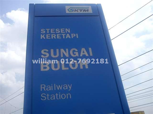
- "Sungai Buloh KTM/MRT signboard".
- "Putra Heights LRT signboard".
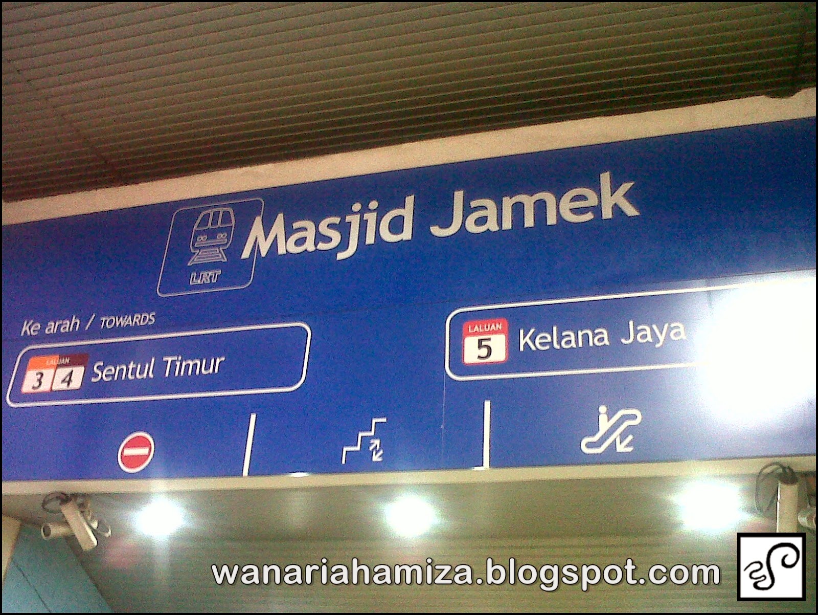
- "Masjid Jamek LRT signboard".
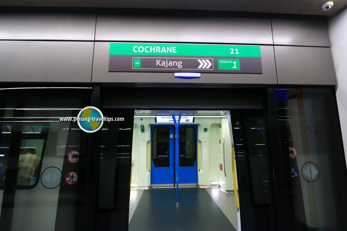
- "Cochrane MRT station sign".
- Sherman, Nick. (July 6, 2015). "Ramones – Ramones album art". Fonts In Use.
- (21 December 2018). "Wear of US Army Insignia Distinguishing Nameplates".
This article was imported from Wikipedia and is available under the Creative Commons Attribution-ShareAlike 4.0 License. Content has been adapted to SurfDoc format. Original contributors can be found on the article history page.
Ask Mako anything about Franklin Gothic — get instant answers, deeper analysis, and related topics.
Research with MakoFree with your Surf account
Create a free account to save articles, ask Mako questions, and organize your research.
Sign up freeThis content may have been generated or modified by AI. CloudSurf Software LLC is not responsible for the accuracy, completeness, or reliability of AI-generated content. Always verify important information from primary sources.
Report