From Surf Wiki (app.surf) — the open knowledge base
Epidemic curve
Statistical method to visualise the onset of an outbreak
Statistical method to visualise the onset of an outbreak
An epidemic curve, also known as an epi curve or epidemiological curve, is a statistical chart used in epidemiology to visualise the onset of a disease outbreak. It can help with the identification of the mode of transmission of the disease. It can also show the disease's magnitude, whether cases are clustered or if there are individual case outliers, its trend over time, and its incubation period. It can give outbreak investigators an idea as to whether an outbreak is likely to be from a point source (such as from a food handler), a continuous common source (with ongoing contamination), or a propagated source (that is transmitted primarily between people).
Epidemic curves generally show the frequency of new cases compared to the date of disease onset.
Examples
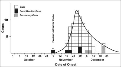
Hepatitis A
This epidemic curve shows a presumed first case, known as the index case on November 6, 1978. 4 days later, there was a steep increase in cases, followed by the curve tapering down to zero. Some cases were food handlers, and some secondary cases. It showed that this is probably a common source outbreak. Sometimes, cases could have been exposed days or weeks prior, and diseases with longer incubation periods would flatten these epidemic curves and lower the peaks.
COVID-19 pandemic
The first description of epidemiological curves from the COVID-19 pandemic showed the pattern of a "mixed outbreak". According to the investigators, there was likely a continuous common source outbreak at Wuhan Seafood Market in December 2019, potentially from several zoonotic events. As of the date of publication of the study, it is unknown which animal may have been the original reservoir of the virus, or how it was originally transmitted to humans. Following this, the investigators found that the outbreak likely became a propagated source, meaning that the virus became able to be transmitted from person to person. The New York Times has published a curve simulator for both the US and the world, on which the visitor can tinker the base parameters to get various outcomes.
References
References
- "Epidemic Curves".
- "Using an Epi Curve to Determine Mode of Spread".
- LaMorte, Wayne W.. (2017-05-05). "Epidemic Curves". Boston University School of Public Health.
- Torok, Michelle. (2003). "Focus on Field Epidemiology". North Carolina Center for Public Health Preparedness.
- (2020-05-11). "Principles of Epidemiology {{!}} Lesson 1 - Section 11".
- Zhang, Yanping. (2020-02-14). "The Novel Coronavirus Pneumonia Emergency Response Epidemiology Team. The Epidemiological Characteristics of an Outbreak of 2019 Novel Coronavirus Diseases (COVID-19) - China, 2020". China CDC Weekly.
- (2020-03-25). "Opinion {{!}} Trump Wants to 'Reopen America.' Here's What Happens if We Do.". The New York Times.
This article was imported from Wikipedia and is available under the Creative Commons Attribution-ShareAlike 4.0 License. Content has been adapted to SurfDoc format. Original contributors can be found on the article history page.
Ask Mako anything about Epidemic curve — get instant answers, deeper analysis, and related topics.
Research with MakoFree with your Surf account
Create a free account to save articles, ask Mako questions, and organize your research.
Sign up freeThis content may have been generated or modified by AI. CloudSurf Software LLC is not responsible for the accuracy, completeness, or reliability of AI-generated content. Always verify important information from primary sources.
Report