From Surf Wiki (app.surf) — the open knowledge base
Descender
Portion of a letter that extends below the baseline of a font or script
Portion of a letter that extends below the baseline of a font or script
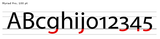
In typography and handwriting, a descender is the portion of a grapheme that extends below the baseline of a font.
For example, in the letter y, the descender is the "tail", or that portion of the diagonal line which lies below the v created by the two lines converging. In the letter p, it is the stem reaching down past the ɒ.
In most fonts, descenders are reserved for lowercase characters such as g, j, q, p, y, and sometimes f. Some fonts, however, also use descenders for some numerals (typically 3, 4, 5, 7, and 9). Such numerals are called old-style numerals. (Some italic fonts, such as Computer Modern italic, put a descender on the numeral 4 but not on any other numerals. Such fonts are not considered old-style.) Some fonts also use descenders for the tails on a few uppercase letters such as J and Q.
The parts of characters that extend above the x-height of a font are called ascenders.
Descenders are often reduced in small-print typefaces for uses such as newspapers, directories or pocket Bibles to fit more text on a page. More radically, on 20 May 1802 Philip Rusher of Banbury patented a new Patent Type with eliminated descenders and shortened ascenders. The type did not prove successful, nor did another use in 1852. The Art Nouveau display typeface Hobo and headline typeface Permanent Headline which also eliminate descenders have both been somewhat popular since.
Some early computer displays (for example, the Compukit UK101) and printers (for example, the Commodore 4022) restricted the vertical spacing of characters so that there was no space for correct display of descenders. Instead, characters with descenders were displaced vertically upwards so that the bottom of the descender was aligned with the baseline. Contemporary systems that did not have this restriction were described as supporting true descenders.

References
References
- Mcclam, Erin. (2007-09-16). "Typeface designers mix art, engineering". [[USA Today]].
- Snider, Lesa. (2013-04-23). "Typography for all: Demystifying text for high-impact messages". [[Macworld]].
- (1856). "English Patents of Inventions, Specifications". H.M. Stationery Office.
- Goudy, Frederic. (1 January 1977). "Typologia: Studies in Type Design & Type Making, with Comments on the Invention of Typography, the First Types, Legibility, and Fine Printing". University of California Press.
- (1804). "Rasselas, Prince of Abissinia. By Dr. Johnson. Printed with Patent Types in a Manner Never Before Attempted. Rusher's Edition". P. Rusher.
- (21 March 2012). "Weird And Wonderful Typography - Yet Still Illegible".
- William White (of Shutford.). (1852). "A Complete Guide to the Mystery and Management of Bees;". Simpkin, Marshall, and Company; and Hamilton, Adams, and Company: Oxford; H. Slatter: Reading; Rusher and Johnson: Banbury; J. G. Rusher.
- (1936). "John Cheney and His Descendants: Printers in Banbury Since 1767".
- "Karlgeorg Hoefer".
- "Commodore 4022 Printer".
This article was imported from Wikipedia and is available under the Creative Commons Attribution-ShareAlike 4.0 License. Content has been adapted to SurfDoc format. Original contributors can be found on the article history page.
Ask Mako anything about Descender — get instant answers, deeper analysis, and related topics.
Research with MakoFree with your Surf account
Create a free account to save articles, ask Mako questions, and organize your research.
Sign up freeThis content may have been generated or modified by AI. CloudSurf Software LLC is not responsible for the accuracy, completeness, or reliability of AI-generated content. Always verify important information from primary sources.
Report