From Surf Wiki (app.surf) — the open knowledge base
Adobe Jenson
| Field | Value |
|---|---|
| name | Adobe Jenson |
| image | Adobe Jenson.svg |
| imagesize | 250px |
| style | Serif |
| releasedate | 1996 |
| based_on | Nicolas Jenson |
| creator | Robert Slimbach |
| foundry | Adobe Type |
| classifications | Old-style |
| Venetian |
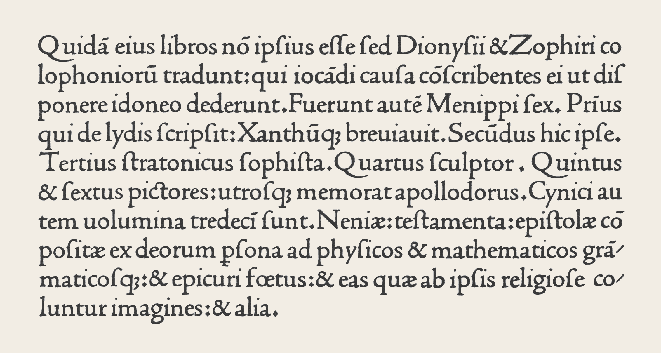
Venetian Adobe Jenson is an old-style serif typeface drawn for Adobe Systems by its chief type designer Robert Slimbach. Its Roman styles are based on a text face cut by Nicolas Jenson in Venice around 1470, and its italics are based on those created by Ludovico Vicentino degli Arrighi fifty years later.
Jenson is an organic design, with a low x-height. It is considered a highly readable typeface and is accordingly often used in book design for body text.
Development

Adobe Jenson was first released in 1996 as a multiple master font. It was created using sophisticated interpolation or multiple-master technology, to create a range of weights and optical sizes suitable for different text sizes. This partial automation of font creation was intended to allow a gradual trend in styles from solid, chunky designs for caption-size small print to more graceful and slender designs for headings. It is now sold in the standard OpenType font format under the name Adobe Jenson Pro. Jenson's type used an 'M' with two-way top serifs and a 'Q' with a curled tail, both now not commonly seen; the default characters are more contemporary forms but both were included as alternate characters.
Adobe Jenson Pro
Adobe Jenson Pro is an OpenType update of the original family. The font family supports Adobe CE, ISO-Adobe (later Adobe Western 2), dingbat character sets. The family comes with 4 weights each in roman and italic, and 4 optical sizes. Supported OpenType features include Stylistic alternates, ligatures, proportional numbers, old style figures, small caps, subscripts and superscripts, ordinals, and swashes (italic fonts only).
| Optical sizes | Caption | Regular | Subhead | Display | Intended point sizes |
|---|---|---|---|---|---|
| 6–9 | 9–13.4 | 13.4–21.9 | 21.9–72 |
References
- Adobe Jenson Specimen Book. Adobe Systems Incorporated, 1996.
References
- "SOTA Typography Award Honors Robert Slimbach". SOTA.
- "DesigningMultiple Master Typefaces". Adobe.
- "The Adobe Originals Silver Anniversary Story". Adobe.
- "Font Remix Tools (RMX) and Multiple Master Fonts in type design". Phinney.
- "TrueType, PostScript Type 1, & OpenType: What’s the Difference?". Adobe.
- Twardoch. (2007). "Arno Pro". Adobe Systems.
- (1998). "Typeface review: Adobe Jenson". Bulletin of the Printing Historical Society.
- William S. Peterson. (1991). "The Kelmscott Press: A History of William Morris's Typographical Adventure". University of California Press.
- (1991). "William Morris: Design and Enterprise in Victorian Britain". Manchester University Press.
- Alexander S. Lawson. (January 1990). "Anatomy of a Typeface". David R. Godine Publisher.
- "ITC Golden Type". ITC.
- "LTC Cloister". MyFonts.
- "Nicolas Jenson SG". Speice Graphics/Ludlow.
- "LTC Jenson". MyFonts.
- "Hightower". Font Bureau.
This article was imported from Wikipedia and is available under the Creative Commons Attribution-ShareAlike 4.0 License. Content has been adapted to SurfDoc format. Original contributors can be found on the article history page.
Ask Mako anything about Adobe Jenson — get instant answers, deeper analysis, and related topics.
Research with MakoFree with your Surf account
Create a free account to save articles, ask Mako questions, and organize your research.
Sign up freeThis content may have been generated or modified by AI. CloudSurf Software LLC is not responsible for the accuracy, completeness, or reliability of AI-generated content. Always verify important information from primary sources.
Report